Designed for the Return Visit: A UK Standard for Brand Assets That Improve With Acquaintance
Most creative work is judged in the room where it is presented. A pack is approved on a mock-up, a campaign is signed off from a storyboard, a website is assessed on a launch-day screen. First contact dominates the conversation because it is visible, immediate and easy to debate. But brands are not built at first contact alone. They are built in the return visit: the same pack met again in a different aisle, the advertisement encountered on a different platform, the website revisited months later by a customer who half-remembers why they bookmarked it.
For UK brands operating in crowded categories, the return visit is often the more commercially significant moment. A first impression may win attention, but familiarity decides whether that attention becomes recognition, preference and, eventually, trust. Familiarity should therefore be designed, not hoped for.
Why first contact receives disproportionate attention
A launch has a natural theatre to it. There is a date, a reveal, a set of stakeholders waiting to respond. Agencies are briefed to make an impact, and impact is easiest to demonstrate at the point of introduction. This is understandable, but it can produce work that is optimised for the unfamiliar viewer rather than the returning one.
The unfamiliar viewer needs explanation. The returning viewer needs confirmation. They need to recognise the brand quickly enough to feel oriented, and then find something that rewards the time already invested. If the asset offers only explanation, it can feel thin on the second meeting. If it offers only novelty, it can feel unstable. The task is to hold both: a clear, repeatable identity with enough depth to make acquaintance worthwhile.
The economics of the second look
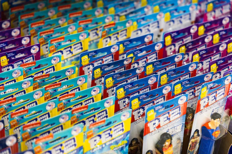
Consider the ordinary life of a UK grocery brand. A shopper passes the same shelf repeatedly, often at speed and under poor mental conditions. The pack must be identifiable before it is read. Once identified, it must justify its place in the basket. A distinctive colour, shape or typographic cue does the first job. A useful claim, a well-judged tone or a detail that becomes familiar over time does the second.
The same logic applies beyond packaging. A commuter may see a campaign on the Underground, then encounter it again in a trade title, then again through a colleague's social feed. Each meeting arrives with less context than the last. The brand has to remain coherent without becoming mechanical. In practice, this means designing a stable core and a variable surface: fixed cues that carry recognition, and flexible elements that respond to context without resetting the brand's identity.
A practical test for repeat value
The return visit can be assessed before launch. The following standard is deliberately simple enough to use in a creative review, but demanding enough to expose assets that depend on novelty alone.
First, remove the context. Cover the campaign line, the channel and the surrounding copy. Can the asset still be recognised as belonging to the brand? If not, the brand cues are too dependent on explanation.
Second, look again for a second layer. Is there a detail that rewards attention after the main message has been absorbed? It might be a considered piece of typography, a recurring visual device, a quietly consistent tone of voice or a structural feature of the pack. The detail need not be clever. It needs to be purposeful and repeatable.
Third, test the asset in an unexpected setting. Place the pack beside a competitor, the poster in a different format, the website page in a search result. Does the brand still hold its character? A strong return asset should be recognisable even when it is not in its ideal environment.
Fourth, check for fatigue. Imagine the asset fifty times, not five. Does it become more familiar or merely more repetitive? Familiarity should accumulate meaning, not simply repeat an instruction. This is where restraint matters. A device that is too loud on first contact can become tiresome on the twentieth.
Fifth, ask what changes. A brand that never varies can feel frozen; a brand that varies too much can feel unstable. The strongest repeat work usually has a clear rhythm: a constant anchor and a changing detail. The second hand on a clock is useful not because it announces a new hour, but because it makes the same hour legible. Brand assets can work in the same way.
Designing for acquaintance rather than novelty
The practical implication is a shift in briefing. Instead of asking only what will make the first impression distinctive, teams should ask what will make the second encounter rewarding. That may mean identifying the two or three cues that must survive every format, then giving creative teams permission to vary everything else. It may mean building a library of repeatable details rather than a single hero execution. It may mean assessing campaigns not only on recall, but on recognition at a distance and after delay.
For UK brands, this discipline is especially valuable in categories where trust is earned slowly: financial services, utilities, heritage retail, public-facing services and any brand that asks for consideration rather than impulse. These are not categories won by a single flourish. They are won by consistency that feels considered rather than repetitive.
The return visit as a measure of craft
A brand is not what it says once. It is what it continues to mean when met again. The return visit is therefore not a secondary concern for creative teams; it is a measure of whether the work has been designed with a life beyond the presentation. The most durable UK brand assets tend to be those that welcome acquaintance. They are clear enough to be recognised, deep enough to be revisited and disciplined enough to remain themselves.
Before the next launch, it is worth asking a simple question: if this asset were met again next month, in a different place and with less attention, would it reward the return? If the answer is yes, the work is likely to keep better time than the campaign calendar alone.