What Survives the Blank Page: A UK Brand Recall Audit
The diagnostic behind the drawing
Most UK brands are evaluated in the presence of the brand itself. Teams review packaging on a shelf, logos in a deck, campaigns in a showreel. This is useful for judging craft, but it is a poor test of memory. Recognition in context can flatter an identity that has not truly been learned. A more revealing exercise is to remove the prompts altogether and ask people to draw the brand from memory.
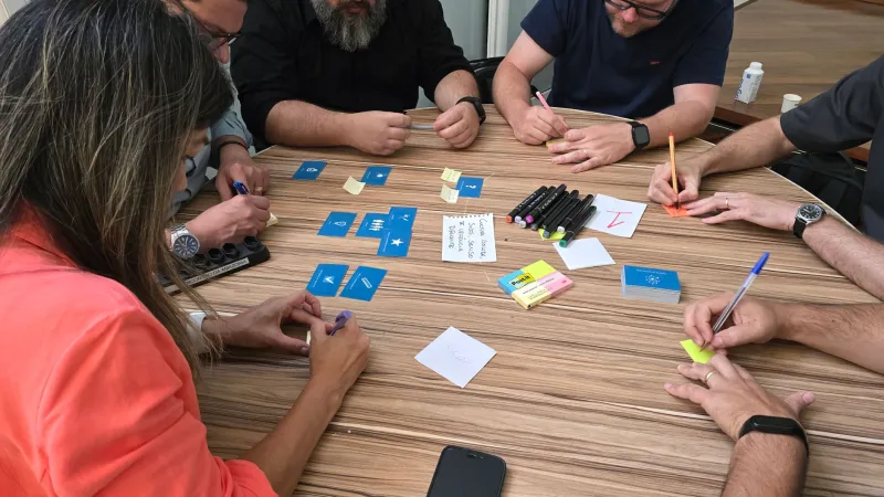
The method is deliberately simple. Recruit a small mix of customers and staff, provide blank paper and a short time limit, and ask them to sketch the brand as they remember it. No logos, no packaging, no reference images. Afterwards, discuss what they drew and why. The purpose is not artistic assessment. It is a retrieval audit: a way of seeing which assets the mind has retained and which have faded into the background.
For UK brands operating in crowded categories, this matters. Distinctiveness is often assumed because a design system is coherent. But coherence is an internal achievement. Memory is an external one. The blank page exposes the difference.
Why memory is a stricter judge than recognition
Memory is selective. It discards detail that does not aid retrieval and keeps shapes, colours, words and characters that have accumulated meaning over time. When someone draws a brand from recall, they are not reproducing a specification. They are reproducing the fragments that have become mentally efficient.
This is why the exercise can be so clarifying. A logo may contain twelve carefully considered elements, but if only two survive the sketch, those two are doing the distinctive work. The rest may still contribute to polish or consistency, but they are not carrying recognition. They are decorative in the strict sense: present, pleasing, but not load-bearing.
There is also a difference between recognition earned by design and recognition propped up by context. A brand seen only on a familiar shelf, in a standard app icon position or against a category colour may be recognised reliably without being memorable. Remove the context and the sketch becomes vague. That is not necessarily a failure, but it is a finding. It suggests the brand is renting recognition from its environment rather than owning it.
How to run the audit in practice
A useful audit does not require a large research budget, but it does require discipline. Begin with a clear brief: which brand assets are being tested, which audiences are being invited, and what decisions the findings will inform. Keep the sample varied enough to compare customer recall with staff recall, and include people who are not immersed in marketing or design.
Give participants a plain sheet of paper and a fixed time limit, perhaps five minutes. Ask them to draw the brand as they remember it, including any words, colours, symbols or characters that come to mind. Resist the temptation to prompt. If someone asks whether they may draw the packaging rather than the logo, allow it. The point is to see what the memory offers first.
Follow the drawing with a short conversation. Ask what they were uncertain about, what they almost included, and what they deliberately left out. These reflections are often as valuable as the sketches. Staff, in particular, may reveal an internal assumption that the external audience does not share. A brand team may believe a particular graphic device is famous; the sketches may show that it is not.
Reading the results without overclaiming
The output should be analysed as a pattern, not a collection of individual drawings. Look for recurring shapes, colours, wordmarks, phrases and characters. Note which elements appear consistently across audiences and which appear only among staff. Consider whether the sketches would be identifiable without the label attached. If the drawing needs a caption to be understood, recognition may be weaker than assumed.
It is important not to treat the exercise as a precise measure of brand equity. It is a qualitative diagnostic, not a tracker. Its value lies in revealing salience and ambiguity. A brand with a strong asset may produce imperfect sketches that nevertheless share a clear common signal. A brand with a fragmented identity may produce drawings that are neat but inconsistent, each reflecting a different point of reference.
The findings can be sorted into three broad groups. First, distinctive assets that survive recall and should be protected. Second, supporting elements that contribute to the brand but are not primary retrieval cues. Third, context-dependent cues that appear only when the category or environment does the prompting. This sorting helps teams decide where to invest and where to simplify.
What UK brands can learn from the blank page
UK brands often inherit rich visual histories. The London Underground roundel, the Cadbury script and the Boots lozenge are familiar examples of assets that have been repeated with discipline over decades. They are not simply old; they are mentally efficient. They can be approximated from memory because they have been designed and managed for retrieval.
Other brands are less fortunate. They may have a coherent system that looks impressive in a brand book but has not settled into public memory. The sketch audit can show whether the problem is the asset itself or the consistency of its use. If an asset never appears in sketches, it may be too complex, too interchangeable or too recently introduced. If it appears in staff sketches but not customer sketches, the issue may be internal familiarity rather than external distinctiveness.
The exercise also has a verbal dimension. Although the method is visual, participants often write down slogans, product names or phrases. These fragments can reveal which language has travelled beyond the marketing department. A phrase that recurs unprompted is doing more work than a line that only appears in approved copy.
From diagnosis to design discipline
The blank page is not a gimmick. It is a reminder that brand equity lives in memory, and memory rewards clarity, repetition and distinctiveness. For UK brands, the audit offers a practical way to test whether the identity is genuinely learnable or merely present. It can inform design refinement, campaign planning and internal alignment without requiring a wholesale rebuild.
At Clock Creative, we treat such diagnostics as part of the wider rhythm of brand management: not a one-off stunt, but a recurring check on whether the work is keeping time in the minds that matter. A brand that can be drawn from memory is not guaranteed to succeed, but it has passed a fundamental test. It has left a mark that survives the absence of the prompt.