Read at Twenty Paces: A UK Brand Audit for the High Street
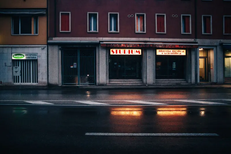
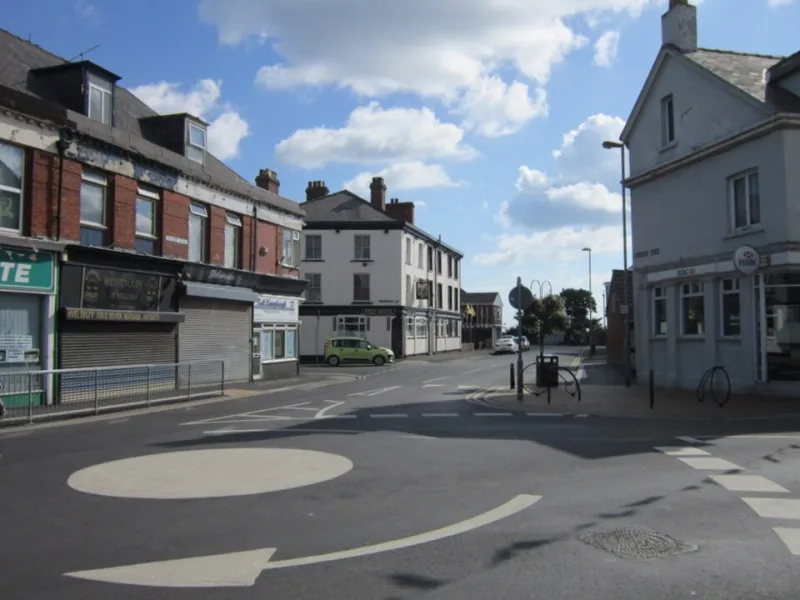
A brand is rarely met in a quiet room. On a UK high street it arrives in fragments: a fascia seen from a bus window, a wayfinding panel at an awkward angle, a market stall half-hidden by a gazebo, a transit poster behind scratched glass. Each fragment is judged quickly and in conditions no design file can reproduce. The screen has taught brands to perform inside a rectangle. The pavement asks whether they can hold their poise when the rectangle is gone.
The street writes its own specification
Digital reviews tend to favour the controlled view. Type is inspected at 100 per cent, colour is assessed on a calibrated monitor, and a layout is judged in isolation. The high street does not grant that isolation. It introduces distance, movement, weather, shadow and competition. A logo that reads cleanly on a laptop may become a soft smudge above a shopfront. A palette that feels distinctive in a presentation may collapse beside the red of a nearby sale notice or the blue of a bus stop.
The practical question is not whether an identity looks good. It is whether it still behaves like the same identity when seen at twenty paces, in drizzle, by someone who is already late. That is a different standard, and it deserves a different audit.
What the feed cannot show
Screen-first work often depends on fine distinctions: hairline strokes, subtle tonal separation, small typographic quirks, carefully graded imagery. These are legitimate assets, but they are fragile outdoors. Physical environments compress detail. Rain reduces contrast. Low winter sun flattens form. Distance strips away the secondary cues that make a mark recognisable.
Material behaviour matters too. Vinyl can lift at an edge. Powder-coated steel can read differently under cloud than under direct light. Uncoated paper on a market stall absorbs moisture and softens ink. Illuminated lettering may bloom at night, turning precise counters into glowing blocks. None of these failures is visible in a PDF. All of them are visible to the public.
The twenty-pace read
Begin with distance. Print or mock up the asset at final size and view it from three metres, ten metres and twenty metres. The first distance tests craft; the second tests recognition; the third tests whether the brand has any chance of being noticed at all. Repeat the exercise in daylight, under grey sky and after dark if the asset will be illuminated.
The twenty-pace view is particularly useful for shopfronts and wayfinding. It exposes whether the name carries the identity or whether the mark is doing all the work. If the wordmark disappears but the symbol remains, is the brand still legible? If the symbol disappears, does the typography compensate? A resilient system usually has more than one route to recognition.
The three-second pass
Most street-level encounters are not reading sessions. They are glances made while walking, driving slowly, waiting for a bus or scanning for a doorway. Test the asset in motion. Photograph it from an oblique angle. View it through a phone camera at arm's length, then through a window. Ask someone unfamiliar with the project to describe what they saw after three seconds.
This is not a test of impact for its own sake. It is a test of hierarchy. If the wrong element survives the glance, the asset is doing useful work in the wrong order. A campaign URL may be less important than the brand name; a temporary offer may be less important than the sense that the organisation is trustworthy.
The material forecast
Every physical asset should have a weather plan. For outdoor graphics, confirm the substrate, fixing method and expected lifespan. For temporary hoardings, decide how the design will age over eight weeks rather than eight minutes. For market stalls, consider how fabric hangs, how shadows fall and how the identity reads from the side as well as the front.
Maintenance is part of brand strategy. A faded banner or a missing letter is not a small operational matter; it is a public statement about attention. The audit should name who inspects physical assets, how often, and what triggers replacement. If no one owns that question, the brand does not have a physical standard. It has a launch moment.
The crowd test
No asset appears alone. A shopfront sits among neighbouring fascias. A transit panel competes with route information. A market stall is surrounded by produce, price cards and other traders. Place the design into a photograph of the real location, not a neutral visualisation. Check whether it holds its ground without shouting, and whether it contributes to the street or merely adds noise.
This is where civic presence becomes relevant. UK high streets are shared spaces, and brands are guests within them. An asset can be distinctive without being domineering. It can be legible without covering every surface. The strongest physical identities tend to understand that restraint is a form of confidence, especially where the public has no choice but to pass by.
A checklist before launch
- View the asset at final size from three, ten and twenty metres in daylight and after dark.
- Test the identity in rain, low sun and oblique angles, not only in a straight-on mock-up.
- Confirm a one-colour and low-detail fallback for vinyl, embossing, small panels and worn surfaces.
- Place the design beside real neighbouring signage and transit information.
- Check material samples for colour shift, reflectivity and weather resistance.
- Agree an inspection and replacement schedule for every permanent or semi-permanent asset.
- Ask whether the asset adds clarity to the street or simply adds volume.
- Record the approved physical specifications in the brand system, not only in a campaign file.
The pavement verdict
A brand that works on the high street is not simply a digital identity reproduced at larger scale. It is a separate performance, with its own distances, materials and obligations. The discipline is familiar in studio reviews: ideas that keep perfect time must also keep their composure outdoors. Before the next campaign leaves the screen, take it to the pavement. Stand back. Wait for the weather. Read it as the public will.